


When opening a business, it’s important to have a good first impression. One way to ensure that is by creating signage that make you stand out from competition.
In a study by FedEx Office, 76 percent of consumers enter a store they’ve never been to before because of its signage. Majority associates these to the quality of product or service the business offers. But the role signage play in a business is often overlooked. Most owners are content in putting up whatever is available without considering its actual impact on brand reinforcement and promotion.
Creating signage is a marketing strategy—it needs deliberate planning and proper execution. Here are some things to consider when creating signage to help you attract customers.
Color
Color says a lot about the identity of your business. Aside from being a form of expression, the psychology of colors aids in brand recall, leaving consumers with certain feelings and emotions that will help make your business memorable.
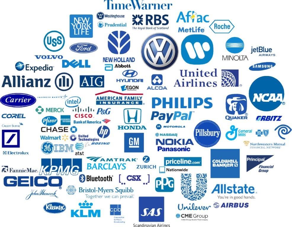
For example, brands such as Coca-Cola, McDonald’s, and Netflix use red in their logos because it translates to excitement and urgency, which drives consumers to use their products or services right away. Yellow exudes cheerfulness, optimism, and vitality, which is why it’s often associated with family-related products. And blue, the most commonly used color in brands, is often found in the biggest and most valuable brands in the world like Ford, Samsung, and Facebook as it is a symbol of serenity, dependability, trust, and security.
Businesses must be able to choose colors that represent their brand. Opting for modern hues can be a good idea as this is popular among consumers—it tells you just what your market needs.
It’s also important to take into account different cultural contexts when it comes to selecting colors for your signage. For example, yellow can mean jealousy, weakness, and betrayal in France while it symbolizes bravery, wealth, and refinement in Japan. Purple bears honor and courage in the United States but it signifies death and mourning in some European nations like the United Kingdom and Italy.
With different cultures assigning their own meaning to colors, signage must be sensitive to these varying perspectives. Color is the first thing a consumer notices (and remembers) about your signage so knowing what to use is a major factor in the decision-making process.
Contrast
Contrast is defined as the differentiation of one thing from another. In terms of signage, it determines the readability of your message. By making sure that your foreground and background design contrast well, the consumers will be able to focus and process your message easier and faster. Greater contrast means greater legibility.
Here are the top five color combinations with the greatest readability:
1.) Black on yellow
2.) Black on white
3.) Yellow on black
4.) White on black
5.) Blue on white
You can also increase contrast in your signage by using shadows, outlines, borders, and graphics that can boost reading speed. Considering the size of elements in your signage also matters in guaranteeing legibility.
Space
By strategically utilizing space on your signage, it avoids too much clutter and naturally makes the message easier to read and understand. Thirty to 40 percent of the signage face area should be made of space to enhance overall visual impact.
Font
When it comes to fonts, use the appropriate weight and style that suits your brand identity. Try to avoid unnecessary styles as these may decrease legibility. Instead, opt for clean, crisp, and simple fonts that reflects the image of the business. Fonts also give emphasis on certain parts of your message you want to highlight, prioritizing words you want your consumers to retain.
For food businesses, curly scripts may appear sweet and delectable while straight fonts may match haute cuisine. Finding the right font is going to build your brand. Here are some typography trends to help your business make an impact on consumers.
1.) Space-themed types: The geometric and the futuristic
2.) Handwritten and brush scripts: The personal and the homely
3.) Vintage and retro: The nostalgic and the classic
4.) Chromatic fonts: The multicolor style
5.) Overlay: The text-and-image design
Think of your favorite brands and pinpoint the elements that make their signage easier to recall—were they able to make the concepts above work together? Coming up with a good signage to represent the business is just as crucial as running the whole thing. As these signage serve as your own brand ambassadors, it’s important to invest in the concept and execution to drive your business to success.