


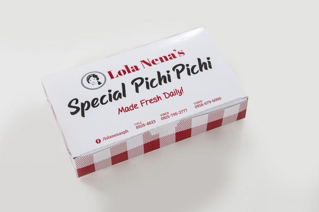
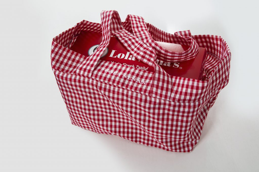
In Derek Ramsay’s house tour that went viral in the latter part of 2020, keen eyes spotted a box adorned with a red gingham pattern when he opened his refrigerator door: It was unmistakably a box from Lola Nena’s, an eight-year-old corner bakery that saw quite a bit of success during last year’s strict community lockdown.
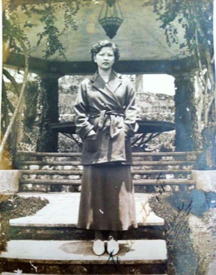
“During the first enhanced community quarantine (ECQ) we never closed [our stores],” says Steffi Santana, chief marketing officer and great granddaughter of Nena Del Rosario Teotico, the lola that the bakery is named after.
“We were concerned for our employees and didn’t know how long the ECQ would last so we provided temporary housing and a shuttle service for them. And because we were the only ones open on food delivery apps, a lot of people who normally wouldn’t order from us or normally wouldn’t see us, saw us and gave us a chance.”
What started as an act of empathy for their employees amid the pandemic grew into a compassionate cup runneth over as establishments around them shuttered. There’s even the story of a massage spa nearby that had to let go of many of its masseuses. In turn, Lola Nena’s offered them jobs; this time, instead of kneading out muscle knots, they would be kneading dough.
But this moment of goodwill was just the beginning of Lola Nena’s drive from a small mom-and-pop store into a recognizable household name.
An eye for redesign
Originally looking only to redesign the interiors, Santana turned to social media for help. She put up an inquiry on the private Facebook group The Best of the Best Manila for referrals and shortly after found herself working with multidisciplinary design studio Morfosis Design.
“Steffi needed an interior designer at first for her stores. It was us who pushed for a brand refresh. And fortunately, they were up for it,” says Pai Edles, co-founder of Morfosis Design.
“Before interior design even starts we have to understand the brand itself. So brand identity and the logo should come first. The brand is how you want the people to see you as a company. It’s hard to do the interiors if the brand itself doesn’t have a clear direction,” elaborates Morfosis Design co-founder Misty Floro.
This integral step allowed Edles and Floro to fully grasp the brand’s values, its target market, and how it can reflect the changing times.
A purer, brighter, and more saturated red was used for good reason: Red is the most common and effective color used in the food industry and is also known to heighten nerve impulses.
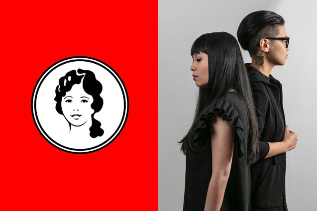
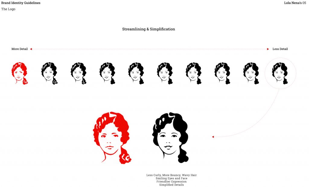
For Santana, the process was quite personal. “Definitely there was some letting go in the very beginning. If you look at our old logo, it was just the words ‘Lola Nena’s’ and the photo of lola. And when I talked with the Morfosis team, one of the attributes that we wanted to apply to our brand identity was happiness and warmth.”
“If you look at our old drawing of Lola Nena, she wasn’t smiling. Lola was a firm lola with a straight face. So I was so happy when Misty and the team thought about giving her a little bit of a smile,” she continues. “It now feels more inviting and more warm. We knew that customers wouldn’t notice that, but me and the rest of the team whenever we see Lola Nena smiling— we have to embody this… the same warmth.”
The Lola Nena’s process
Edles and Floro together with their graphic designer Jason Jaring had to make sure that while the refresh allowed the brand to grow and evolve, it shouldn’t alienate their loyal customers. “It was hard because we had to think if people would think this was a different Lola Nena’s,” says Santana. “At the same time we were like, ‘I think we should just take the plunge.’”
Morfosis Design started with Lola Nena’s portrait in the logo. By giving her a slight smile and a friendlier expression, they were able to imbue the logo with a happier look. Simplifying the details and removing some of the curls gave it a wider range of application. The original font was updated to a modified Abril Fatface font, which offered a more contemporary look. “Not too modern, not too traditional, but an expression of subtle nostalgia. Like the Sunday afternoons we remember with Lola,” according to the team.
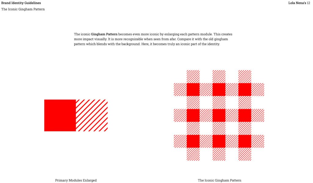
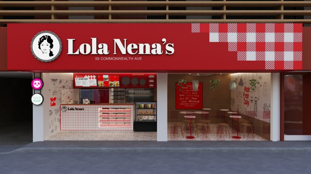
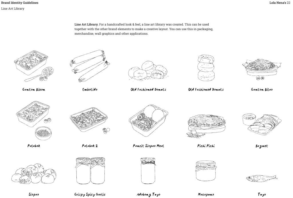
The iconic red gingham pattern Lola Nena’s is known for was even more emphasized by enlarging each pattern module. This created more visual impact and allowed it to be more recognizable from afar. A purer, brighter, and more saturated red was used for good reason: Red is the most common and effective color used in the food industry and is also known to heighten nerve impulses. A line art library of all Lola Nena’s products and ingredients were designed, which also found its way on the wall of a branch’s interiors as a mural.
As more and more of Lola Nena’s branches are getting updated with this refresh, Santana has been met with positive feedback. “A lot of my friends are asking about franchise info now that they see our stores have a new look. Now we’re kind of rushing to get all the other stores up to speed to how Morfosis envisioned it. They’re so much nicer and much more aligned with our brand.”
From being at the bottom of food delivery apps to now being a recognizable company that can churn out up to 50,000 doughnuts in a day, Lola Nena’s growth during the pandemic is filled with plenty of lessons we can all learn from.