JJ Acuña is no stranger to the F&B industry.
Whether in the the Philippines or Hong Kong where he is currently based, the designer and creative director behind the eponymous interior design studio JJ Acuna/Bespoke Studio has always had a knack for transforming spaces and carefully constructing an experience that sits right with both the establishment and the customer.
In 2018, he successfully rebranded Tokyo Tokyo, deftly referencing Hotel Okura and “Blade Runner,” and tweaked the DNA of Hong Kong cafe Elephant Grounds to suit the nuances of the Filipino market. “Whether it was an update on materials or the stadium seating or some kind of unique art piece, we made sure that there was a twist—something different for the local market,” he says.

More recently, Acuña brought the fine dining German restaurant Heimat by Peter Find to life with inspiration from the Barcelona Pavilion by Ludwig Mies van der Rohe and Lilly Reich. Its comfortable seating and sleek lighting keep the restaurant warm and homey amid the cool blues of the walls. He is also set to open at least three more F&B concepts in Hong Kong throughout the year.
For now though, Acuña is back in the Philippines to spend time with family, let his Hong Kong staff take the reins of the company, and “set up shop and see what’s possible here.” It’s that last bit that got us interested, especially given his eye for design.
“If there are a lot of people who are doing amazing things in the F&B space, everything can dialogue with each other. Everything is a communication and a conversation,” says JJ Acuña.
“There are so many amazing things I see in town since I was last here —more concepts and more unique projects that I find really interesting. If there are a lot of people who are doing amazing things in the F&B space, everything can dialogue with each other. Everything is a communication and a conversation.”
Here, he lists five of the most compelling restaurants in Manila that have caught his eye.
1120 House
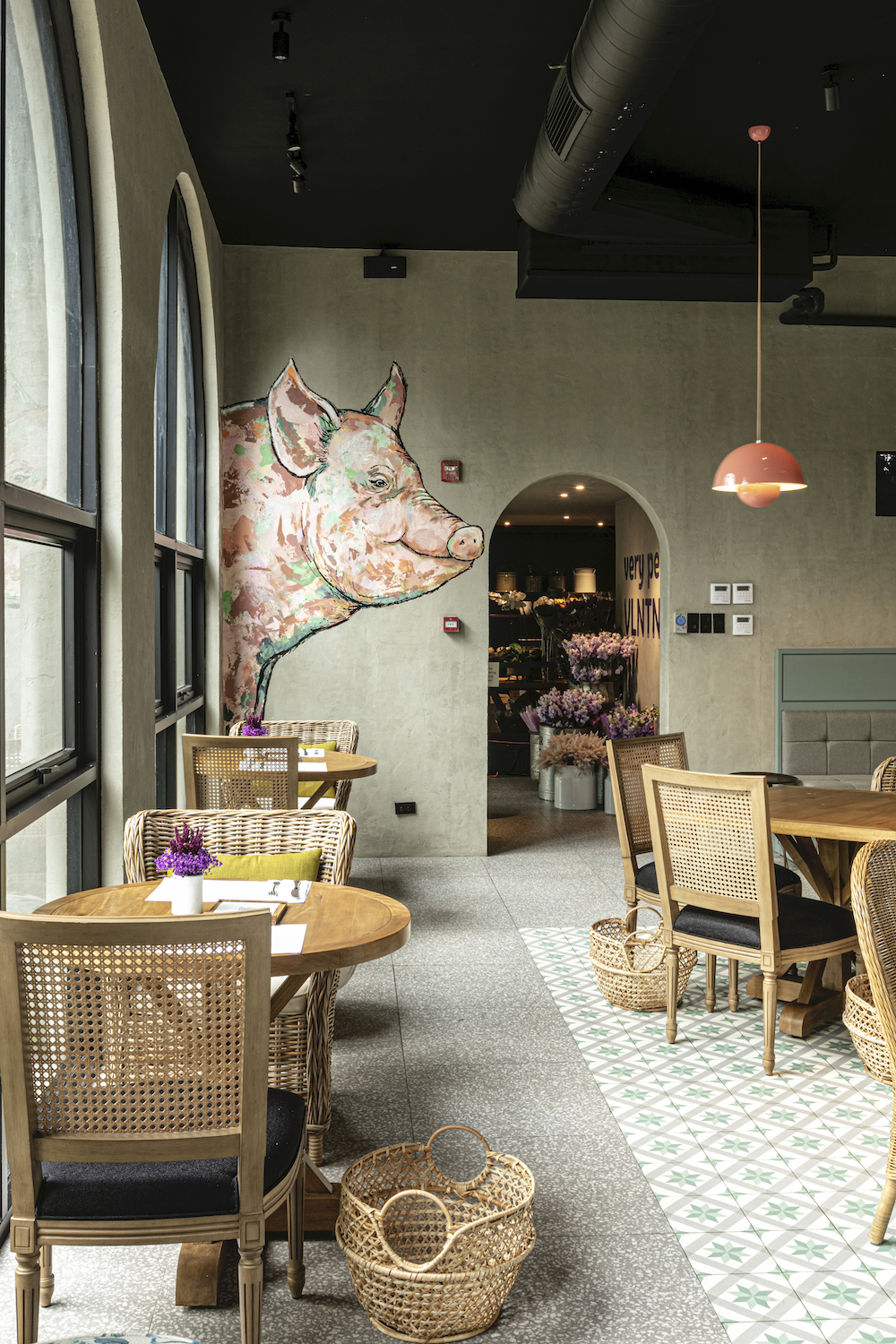
“1120 House is a great example of what I mean. It’s very welcoming. It’s got bespoke art. It’s got a flower shop and a dry good store combination. It’s a space where you can just really relax and spend most of your day and hang out,” Acuña explains.
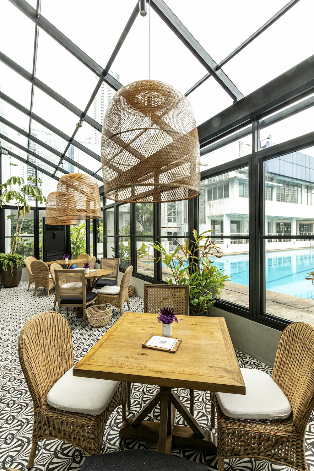
1120 House’s creative director Pam Gonzales Lopez commissioned architect Jacy Medina of Open House Design who opened the space up and added sophisticated arched windows to the structure. Kitty Bunag of Craftsmith Guild sourced the local furniture and helped make the entire establishment (which is actually made up of three different brands: Bon Appetit Café at the House, Rustan’s Flower Shop, and Lady Scott Jones) feel cohesive.
“1120 House is quite Instagrammable and yet they still thought about proportions and comfort,” Acuña adds.
Assembly Hall
“Assembly Hall is another really great concept by Harvey Alumisin. It’s a third wave coffee shop in Makati. It’s very unique. I love the materials. I love the lighting. I love the form of the architecture,” Acuña gushes.
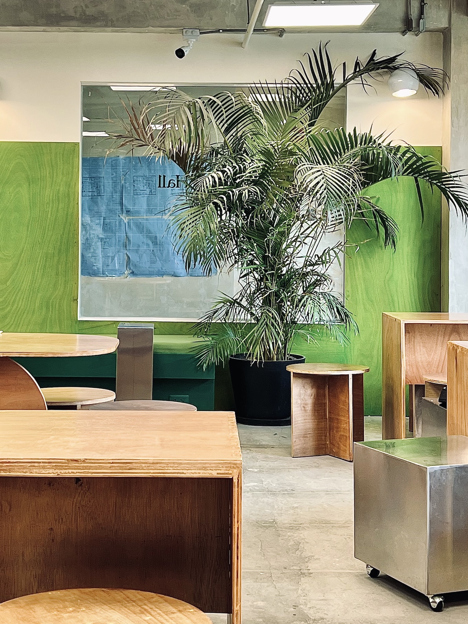
Assembly Hall is situated on the outskirts of Poblacion and features a stainless steel counter, custom wooden furniture, and a glass block wall. Alumisin worked together with interior designer Mara Manalo of Studio Mara to realize the space.
“The people making coffee there really know what they’re doing. It’s a very unique offering. I can take my journal there and kind of hang out there the whole day. Everything is sleek and Gen Z style with plants and natural light. It’s very comfortable the way [Alumisin] designed the furniture and everything.”
Metiz
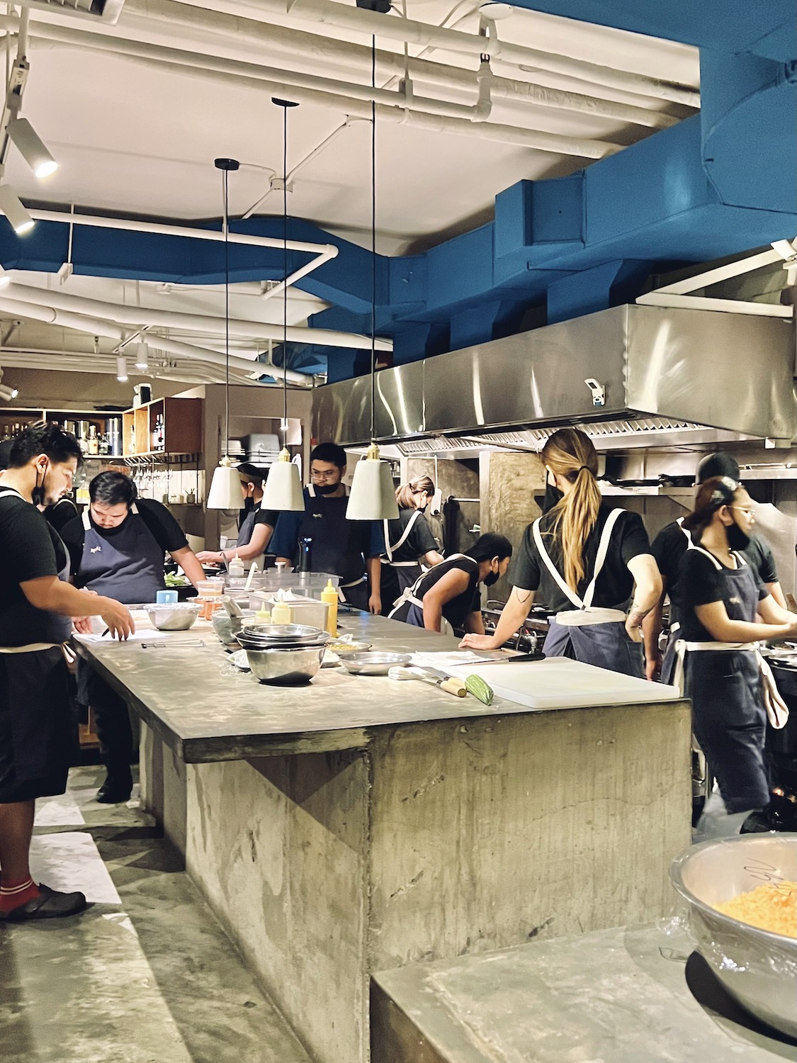
“Metiz is an open kitchen concept. It feels like you’re part of the action. No frills but great form and great architecture inside. Even though it’s a clean concrete, stainless steel, and plywood type of place, there are certain elements when you enter like the signage and the stone that’s being used. It just really feels like there’s some good texture.”
“I really love the curvilinear form of the banquette and the indirect light. It’s just an added poetic touch and it’s very subtle. You can miss it. The whole banquette is a light feature,” JJ Acuña says about Metiz.
“I really love the curvilinear form of the banquette and the indirect light. It’s just an added poetic touch and it’s very subtle. You can miss it. The whole banquette is a light feature,” Acuña says about the restaurant helmed by chef Stephan Duhesme and designed by architect Justin Guiab.
M Dining + Bar
“This one is not super new but M Dining + Bar is a classic. Very classic. I love how the bar is its own place and how it in itself is a destination.”
Led by chef Tom Bascon and designed by architect Alfred Wieneke, M Dining + Bar has been a quintessential fine dining mainstay in Makati since 2016. Hardwood floors, crisp linens, and soft lighting define the space. The bar has a separate room and offers an extensive selection of gin and Japanese whisky.
“I love the tablecloths and the flower arrangements. I love the setup . Nobody is in each other’s face. I love the colors, I love the art. It’s very subdued. It’s contemporary. It’s comfortable. It’s elegant, it’s elevated, it’s ageless.”
Buccaneers Rum & Kitchen
“A complete opposite of that is a wacky place in Poblacion called Buccaneers Rum & Kitchen. The whole thing is a pirate ship! I get what they’re doing. It could have come up tacky, but if you say ‘This is my concept and this is what I want to run with,’ go all the way. And that’s what they did. They made it work because they spent a budget on it. The lighting is correct. The details and touches are correct. The space planning is correct. In between the nooks and crannies, the styling, and location of furnishings is absolutely correct,” Acuña says.
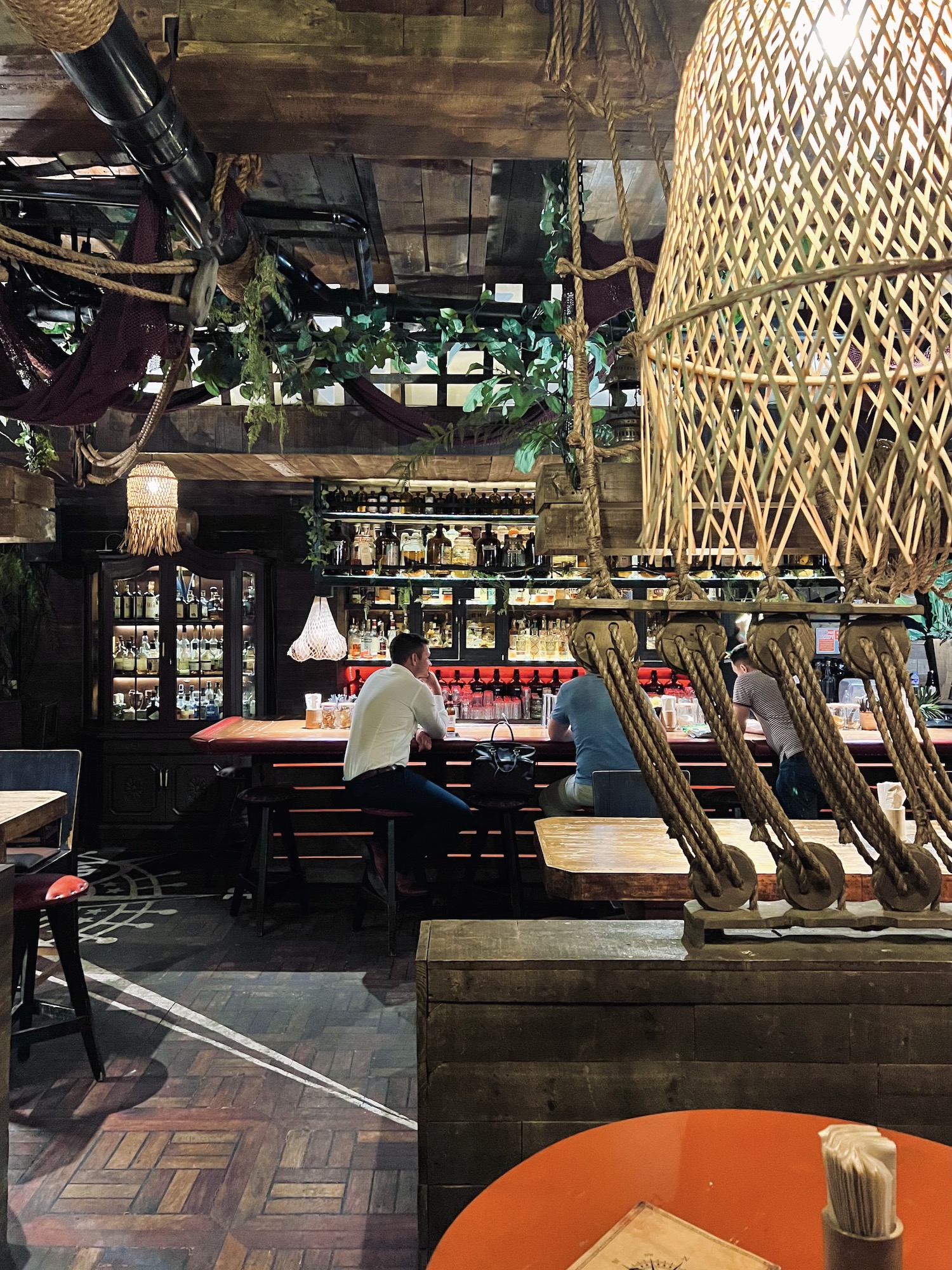
Owner Vincent Landais (who also runs Dr. Wine) took charge of designing the space all on his own, from architectural drawings and managing the construction to the interiors. Stepping inside makes you feel like you’ve stepped into an old pirate ship. Wooden barrels are used as small tables while the nautical ropes create the illusion that it is holding up a ship’s mast.
“It is something you can photograph for Instagram, but it’s something you can come back to again and again because the food is really good. The drinks are great. The price point is great. The lighting keeps things subdued so that the decor doesn’t appear so over the top. I don’t do themed concepts myself, but this is a themed interior that is looking out for longevity in the business.”


