
When Tokyo Tokyo decided to embark on its biggest redesign project to date, the legacy of the 33-year-old Japanese fast casual restaurant chain was left in the hands of an outsider.
As markets shift and the economy tilts, so does the restaurant industry. Any business will have to realize that the life cycle of its brand is at the mercy of the market, and how it responds to the constantly evolving consumer taste determines if it will stay top of mind. It’s a challenge that also played a role in Tokyo Tokyo’s decision to partner with Hong Kong-based multi-disciplinary architect JJ Acuña in redesigning its 3,750-sq. ft. flagship store in Trinoma.
Rebranding is a complex and risky process given the investment necessary to tackle it but Tokyo Tokyo’s approach is a comprehensible study in clarifying an identity that meets the challenges inherent in today’s market: those of design, space customer, and competition.
“We want to make sure that we remain relevant,” says Natalie Perez, Tokyo Tokyo VP for marketing. “When we do our brand review, it’s always holistic—understanding internal strengths and weaknesses, looking at opportunities and threats from the outside. In this case, we were firm that Tokyo Tokyo is a fast casual restaurant, but the ambiance was something we wanted to elevate. We knew it was one of the touchpoints we wanted to fix.”
Rebranding is a complex and risky process given the investment necessary to tackle it but Tokyo Tokyo’s approach is a comprehensible study in clarifying an identity that meets the challenges inherent in today’s market: those of design, space, customer, and competition.
Though Tokyo Tokyo employs an in-house design team, the decision to hire Acuña is an expression of an entirely reimagined identity. Having worked on projects like the slick Elephant Grounds Coffee in Hong Kong and the Old World Chinese glamor of Little Bao in Bangkok, the award-winning designer’s deft touch in food and restaurant design cuts through the traditional fast food notions in favor of unabashedly Japanese references from Hotel Okura, fusuma screens, and traditional Japanese houses called minka, and even non-Japanese inspirations like 1982 film “Blade Runner.”
“The first questions our designers considered was how to make a fast casual restaurant more humanistic in its approach to making a customer feel better about themselves before and especially after a meal, and then how could our designers make design moves that are considerate of culture, not just Filipino culture, but also Japanese culture, without having to offend, ‘Disney-fy’ or simplify either to find a complete design,” says Acuña.
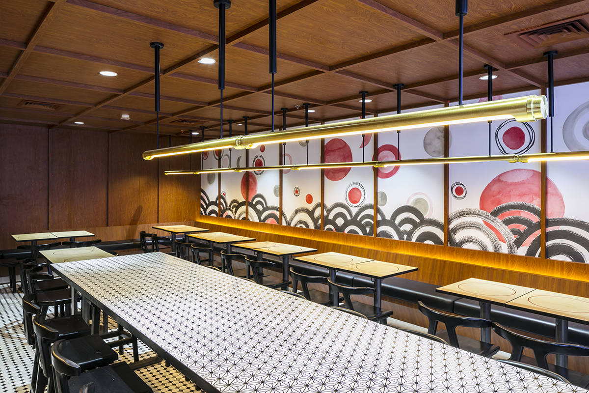
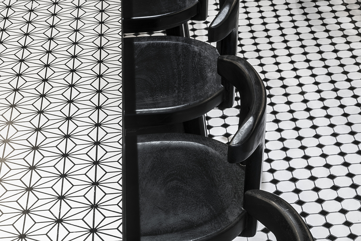
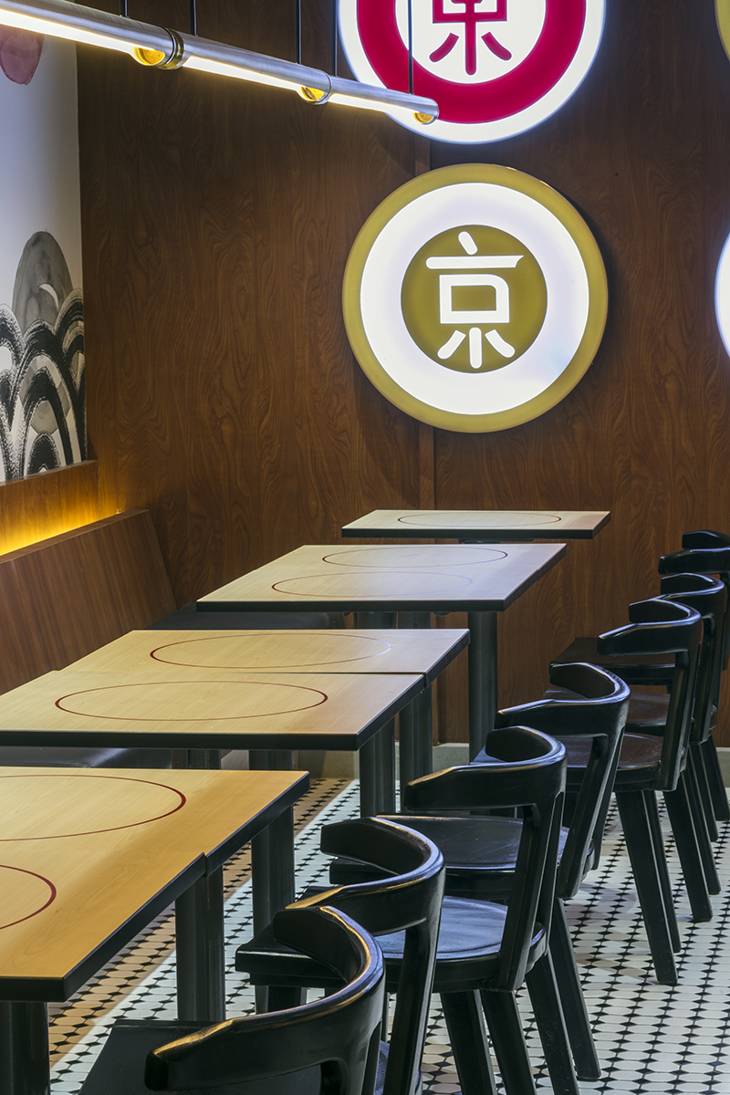
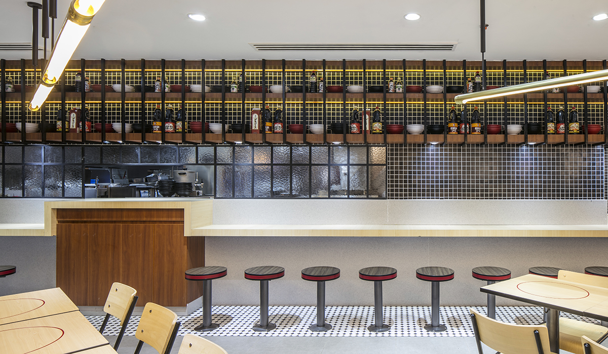
One of the most important factors in the redesign is reinventing the expansive space for ambiance and texture. Acuña harnessed it by dividing all 375 square meters into distinct areas—the garden room fluidly opening from the grid doors into the space’s biggest section; the chef ’s room where the kitchen is located and food dispatched; the street stall located along the mall corridor; and the tatami room paired with a Michell Lie mural playfully inspired by the concept’s signature circles and colors, custom “tamaraw” chairs, and bold light fixtures that carve into the negative spaces and, as Acuña points out, “gives guests the ability to come back more than twice a week and have a different room to sit in and experience.”
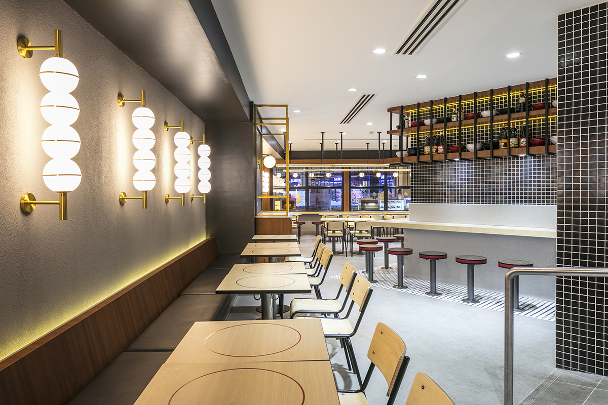
In between, black metalwork and ceramic tiles are relegated to the edges, margins, and unassuming scopes to arrive at a cohesively galvanizing and modernist look. “The store is their first impression of the brand,” echoes Perez. “Food right now is not just the only reason for customers to come. When you open a restaurant, it’s a given that you need to offer great food but if you want to be an enduring brand, you need to consider the overall experience.”

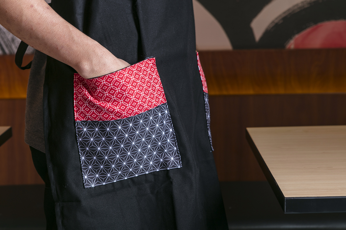
At several points of the restaurant, traditional Japanese patterns (wagara), particularly the wave crest (seigaiha), hemp leaf (asanoha), and tortoise shell (kikkou) are ubiquitous on select tabletops, signage, and service staff uniform.
“It was a store redesign but it became an overall rebrand. So these Japanese patterns in the store were also featured in the uniforms, including the headgear and aprons,” says Perez. “Before, the uniforms looked somber with the old kimono-inspired attire but now it’s younger, lighter, more casual with just the gray polo shirt, patches, patterns, and subtle details.”
“The day after the restaurant reopened, the flagship store experienced double digit sales growth and earned a 20 percent or more surplus of sales compared to the same date the year before.”
While Tokyo Tokyo stores normally undergo renovations every five years to address wear and tear, the restaurant redesign became the propelling force to turn the renovation into a total brand transformation while retaining the value proposition and engaging new demographics.
Rather than simply aim for a physical rebrand, Tokyo Tokyo drove through with Acuña’s suggestion to reevaluate all aspects of the brand, including the uniform design and the existing logo. Using the same fonts, the subtly refreshed logo now sports a completely black typeface with clear Os then encased in red bars that, while alluding to the familiar trademark, aligns with the flagship store’s precise new direction: to become the testing ground for new products and decisions before rolling out to all of its stores nationwide.
In spite of the flexibility afforded to Acuña, Perez clarifies that while reimagining an identity is a strategic investment to place themselves in a position of growth, knowing the brand is a necessary requirement to be able to implement the motives behind it in the first place. Otherwise, rebranding for unclear or wrong reasons such as poor brand awareness or slow sales would do more harm than good.
“It’s not about having a timeline. You should always review your brand and understand your market to see if it really needs to be refreshed. What’s important is understanding your brand really well, what the customers expect, and what’s out there,” Perez says. Tokyo Tokyo’s rebrand reveals that getting it right can transform not just your image and story but also your hold on your audience.
The day after the restaurant reopened, the flagship store experienced double digit sales growth and earned at least 20 percent surplus of sales compared to the same date the year before. “When both parties see an opportunity to place the right effort and investment, the outcome is truly unexpected and positive,” says Acuña.
Originally published in F&B Report Vol. 15 No. 5